

Color Standards: Why your fashion brand needs them & which ones you should use
Let’s talk about color standards. Color standards are absolutely mandatory for communicating with team members and factory partners during the development process. With so much variation in screens and how colors shift between various applications, knowing what the color looks like in real life is critical.
Pantone is the most commonly used color standard service in the apparel industry. There are other services but Pantone has become the global leader in this space. Start with their library of colors and if you can’t find the perfect color there, try making your own standards.
3 different color standard systems: DIY (left), Pantone TCX (center) & Pantone TPG (right)
When I was working on my very first freelance project designing prints for a client, I asked which color standards they used. I was a little surprised they used Pantone TPG color standards.
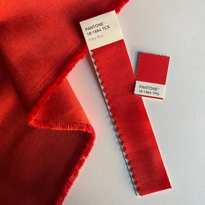
“TPG” stands for Textile Paper Green - this is the paper version of Pantone’s “TCX” - Textiles Cotton Extended Range.
I admit it. I was a color standard snob.
I couldn’t believe that they used PAPER color standards for printing on FABRIC. How did that even WORK? When I worked as a designer for a larger brand, I only used TCX standards. At the time, that made the most sense to use a cotton fabric color standard to best determine and match color on dyed and printed cotton fabric. Apples to apples.
But my client assured me that it was fine so I went ahead and used TPG color standards to create my prints artwork files. I was skeptical.
But I quickly changed my POV when I looked into getting a swatch set of my own.
Pantone TCX color standards are $$$$. It’s a $3,000 investment for their smallest swatch set with 1” x 1” removable swatches (image below). That can be outside the budget for a smaller start up brand.
Pantone does have less expensive cotton guides available, but the swatches cannot be taken off the pages which makes them very hard to work with.

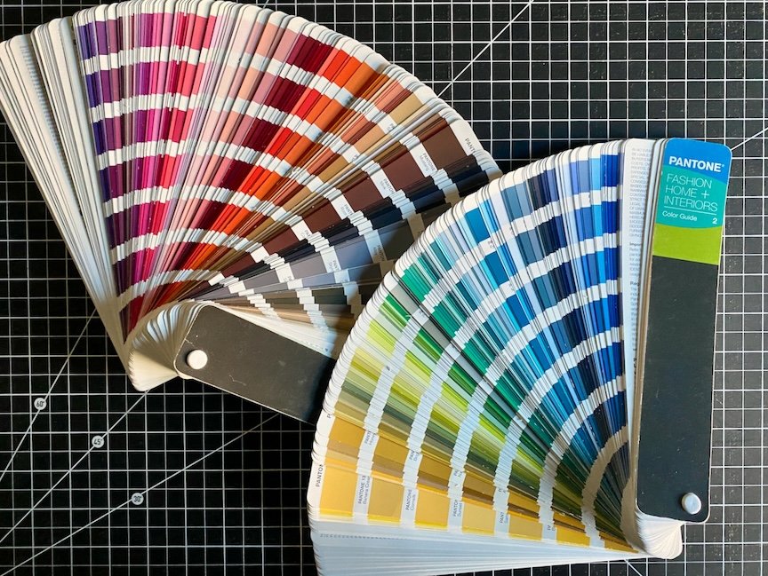
The Pantone TPG color system is a more affordable option. The small paper guide is $260 and fans out like paint chips - which is a little awkward for building a color palette. (see below)
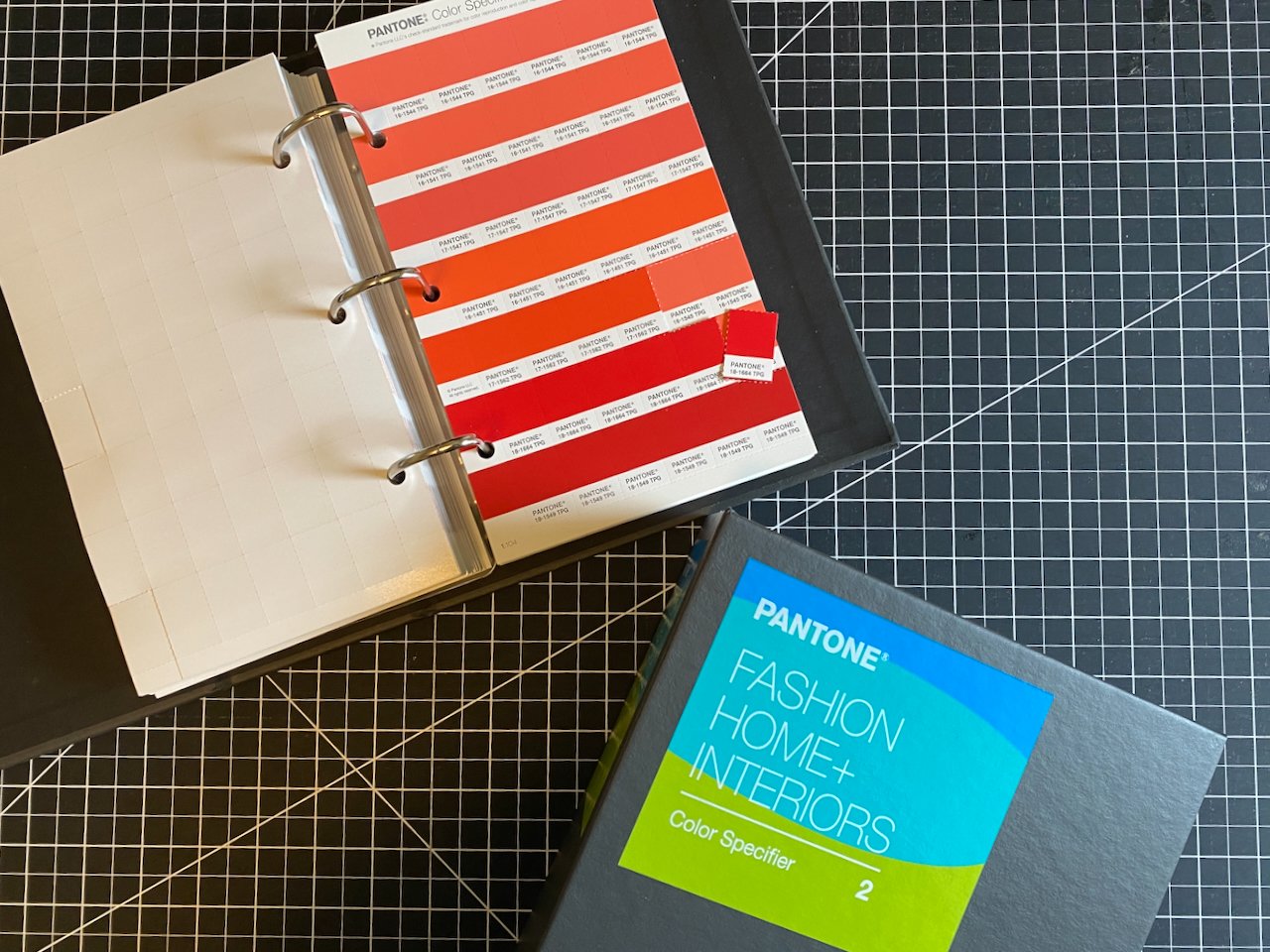
The TPG Color Specifier (paper) allows for chips to be removed but it’s a little spendy at $800. However, the investment is well worth it since most factories have access to these standards. And being able to communicate in the same color standard language is a HUGE time saver.
I’ve found that TPG paper standards are close enough to their TCX fabric counterparts. The truth is, there’s always going to be some tolerance in color matching. It’s very rarely 100% perfect. How wide the variation is depends on the brand and their standards. In general, 5-10% tolerance for color matching is fairly standard within the industry.
Turns out, the paper TPG standards get the job done just fine. And for a lot less moolah.
As long as everyone is looking at the same thing, it works. The colors you receive on print strike offs or in lab dips will be close enough.
Another Pantone tool that that I use frequently is the Pantone Connect plug-in for Adobe Illustrator. I use this to create color palettes and factory-ready artwork packages. It’s a huge time saver by having the entire Pantone library available digitally.

Screenshot of the Pantone Connect plug-in for Adobe Illustrator (on left) - Pantone TPG spot colors shown in the swatches window (on right)
That said, Pantone Connect is NOT perfect and some colors don’t look right on screen. (Bright white will look dingy and gray on my screen.) So again, that’s where having a physical standard to cross-reference comes in handy. Always check the colors IRL. (Do people still use that acronym? Or is it considered passé, like skinny jeans?)
DIY Color Standards
I’ve used custom dyed fabric, pieces of garments cut up into swatches, and other color trend services that used yarn or embroidery floss. If Pantone doesn’t have the exact color you want, you can always DIY it.

The most important part of any color standard “system” is in sharing whatever it is with the factory or fabric mill. Whether it’s through including the Pantone color codes on a pitch sheet or sending labeled or coded physical swatches to the vendor, communication is key.

If you really need a fabric swatch, Pantone TCX swatch cards (4” W x 5” L) can be ordered once you’ve selected colors from a TPG guide. Pantone retails these for $14.90 a piece.
The fabric itself is folded at the bottom and held in place at the top. The swatch cards can be cut apart into 4 strips (1” W x 5” L) which keeps the color code attached for easy reference.
If you’re very industrious, you can get a little more bang for your buck and take the standard apart, unfold the fabric and cut it apart into smaller swatches. But that’s A LOT of work.
Here’s a breakdown comparing TCX, TPG & DIY color standard systems:
System: Pantone TCX (Fabric)
Pros:
Easier translation to fabric for lab dips, printing etc.
Swatches can be re-ordered & replenished
Great for showing people who can’t imagine how a color will look on fabric exactly how the color will look on fabric
Cons:
Expensive $$$
System: Pantone TPG (Paper)
Pros:
Budget-friendlier $
Easily accessible
Gets the job done
Cons:
Sometimes difficult to translate to fabric
System: DIY (Do It Yourself)
Pros:
Pantone might NOT have the perfect shade of green (or blue or pink etc.) that you have in mind. Use yardage from a fabric/thrift store or cut up a garment that is the perfect shade of whatever. Get exactly what you want.
Colors will be more unique, allowing you to set your brand apart from your competitors and stand out in the market
Cons:
If the fabric is textured or isn’t 100% cotton, it could be difficult for the factory to match
Time consuming - you have to create physical and digital swatches
Shipping swatches to factories could be $$ depending on how many and how far away they are
Limited quantities - once you cut up that shirt/pant or whatever - it’s gone!
(Pro-tip: once you’ve done a production order using a custom/DIY color standard, ask the factory to send you a few yards so that you can replenish your supply.)
The moral of the story is, make sure you have and USE a color standard system. Don’t just send out a print artwork file to a factory and expect to receive a strike off with colors that match how it looked on your computer screen.
If you’re looking for discounts on Pantone color systems, Hyatt’s is a good resource. E-bay has a selection of used and new sets for discounted prices too.
Pantone Connect subscriptions are available through Pantone.
Last words of advice on color standards:
Don’t leave color standards out exposed to light or daylight - keep them covered up & put away when not in use.
Make sure you wash your hands before handling color standards. Keeping them clean will help them to last longer.
Replace your standards every few years. Pantone regularly adds to their library of colors, so you’ll want to have the latest and greatest. Colors will also fade over time. (See first point.)
Don’t EVER use yarn or embroidery floss as a color standard for ANYTHING except yarn and embroidery. Just don’t do it. Trust me on this one.
Does your brand need help with color? Let’s connect! Hit the contact link below and drop me a line.